|
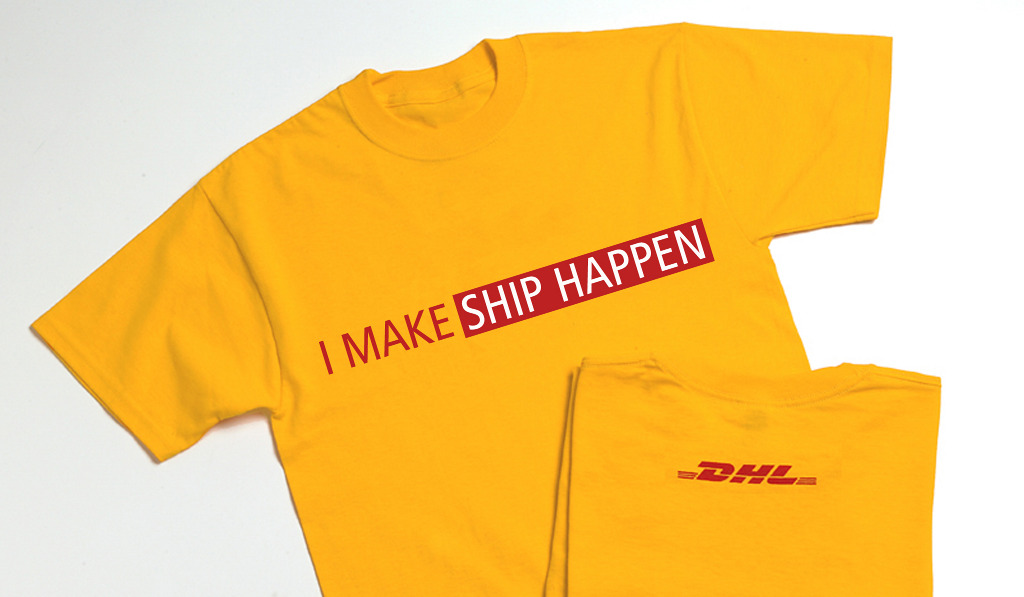
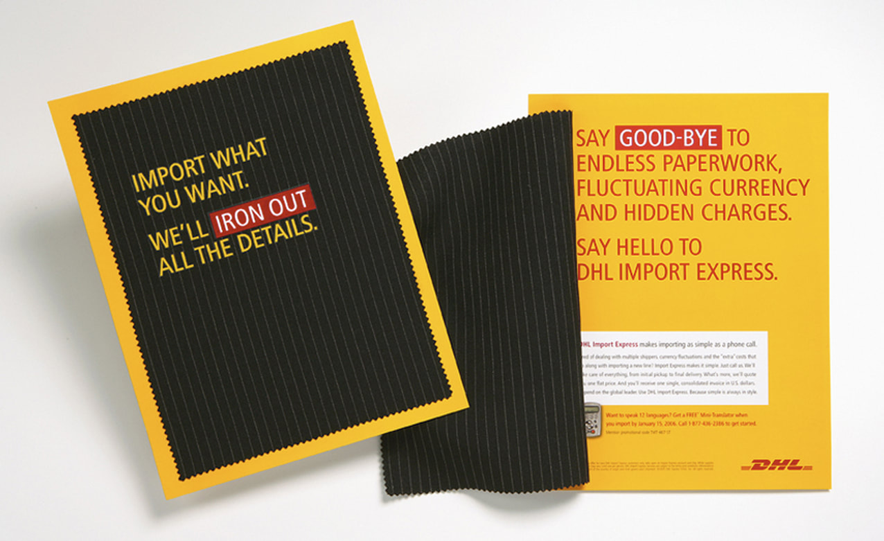
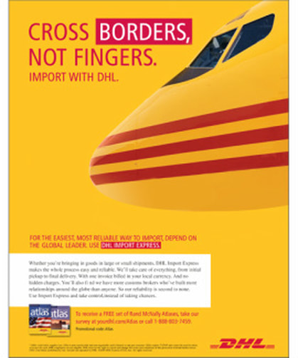
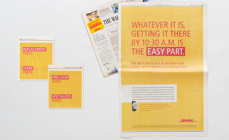
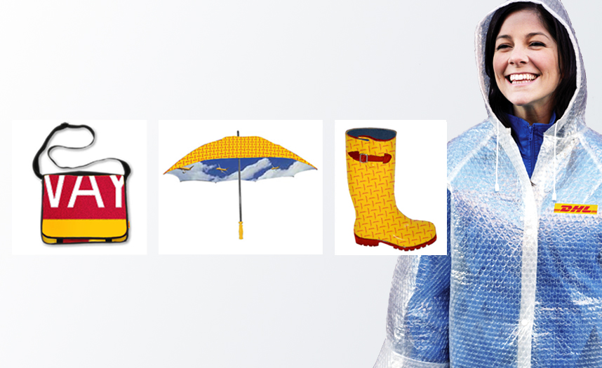
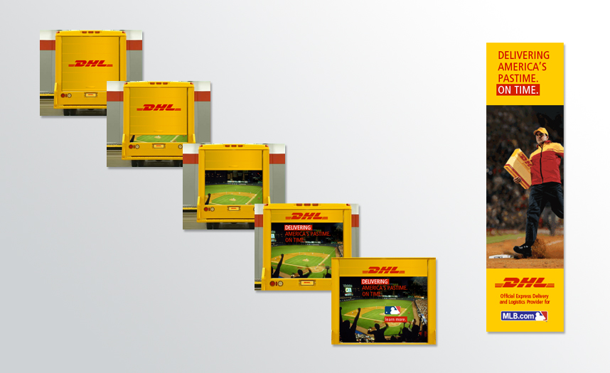
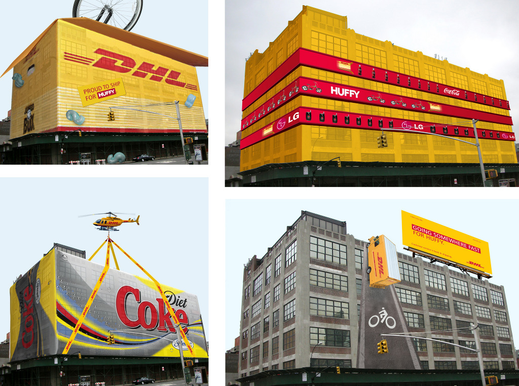
Just because a brand has two bold colors does not mean that everything has to look exactly the same. From WSJ ads to high-impact inserts, from direct mail to promotional items for Fashion Week, to the DHL building designed to be a "tourist destination" in midtown NYC — with a focus on the key target each piece of communication has its own bold and uniquely appropriate approach.
|
|
|
THE CHALLENGE Two eye-popping colors. As a designer, I always welcomed the challenge to come up with a fresh way of using the colors red and yellow. (and even managed to get a couple of my own headlines into the mix.) |
|
|
|
THE SOLUTION Going beyond color to conceptualize with material and application. Most importantly, always think of your target audience, whether they are commuters stuck in traffic at the Holland Tunnel or fashionistas dealing with a rainy season in NYC. It all paid off, as I was part of the team who received the Ogilvy award for Best Integrated Campaign working with some amazing and inspiring talent. And DHL gained market share and much needed U.S. brand recognition. |