
|
BRAND IDENTITY
|

|
|
|
|
|
THE BRIEF
After having a personal experience of a collar bone injury, fashion designer Kate Kirilcuk, came up with an idea that would combine her years in the fashion industry with the experience of being a patient. From the frustration with the banal industry of all-blue medical wear, the concept of Not Blue Designs was born. Having an injury makes you "blue" enough. Not Blue Designs was the perfect antidote. There was nothing else like it in the market. The challenge was to get people to take notice. |
THE SOLUTION
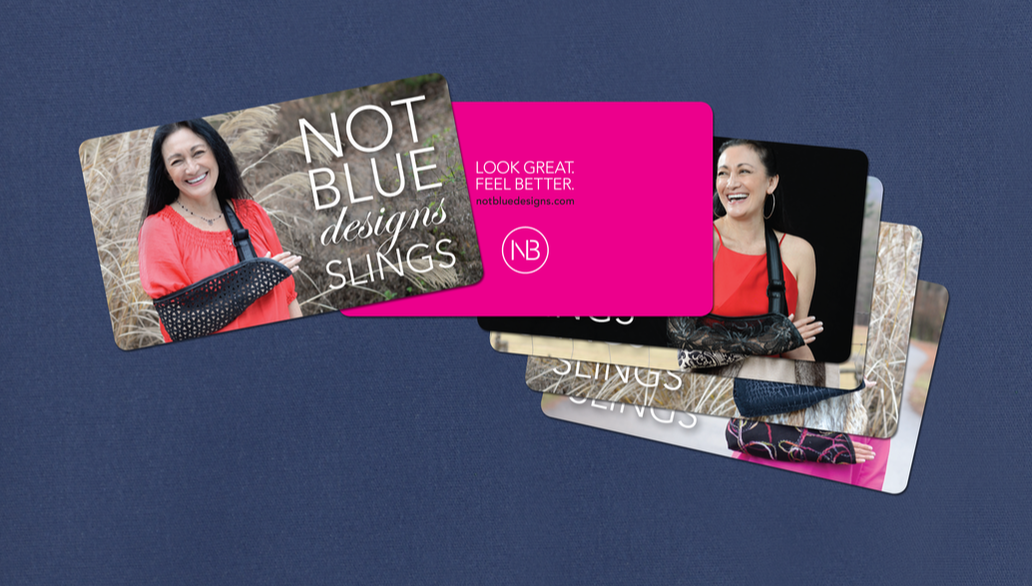
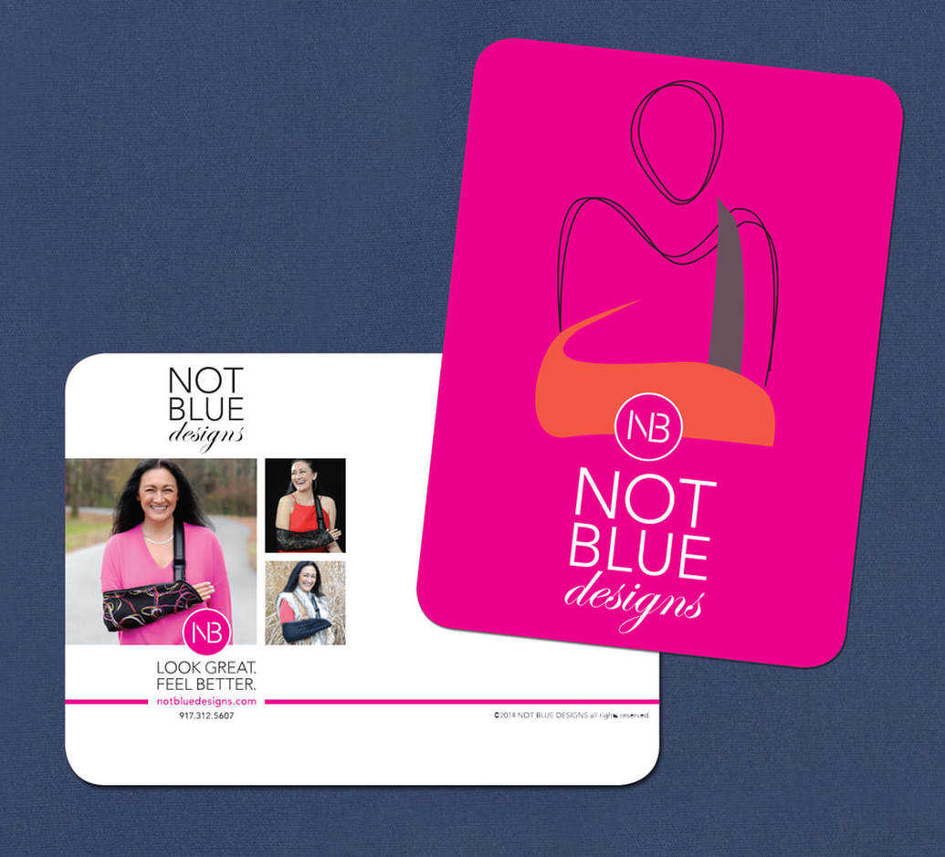
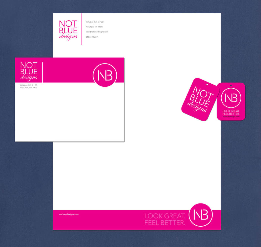
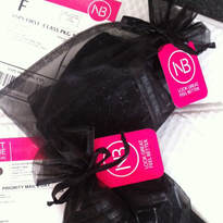
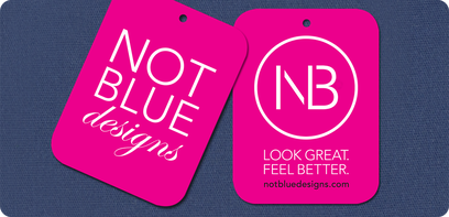
To create a meaningful brand identity, we wanted to clearly show both the functionality and the style of the product. The solution? An illustration to give a quick read, a breakthrough color — magenta — so the product stands out in the “sea of blue,” and a clean, modern approach to convey style and quality. The color and upbeat graphics are a bold statement in both dreary doctor's office and pharmacies. Mission solved. |
|
> Logo
> Icon > Landing Page > Etsy Banner > Fabric Label |
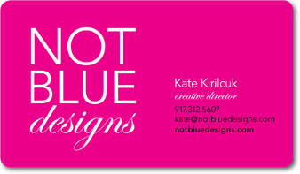
> Business Cards
> Letterhead > Label > Hang Tag > Leave Behinds |
+ Competitive Analysis
+ Photoshoot Production + Retouching + Naming Nomenclature |