
|
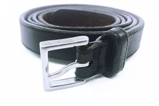
Nope, not talking about karate black belt. However, I do want your brand to be strong and invincible. I am speaking to a simple little black belt that I have. So why should your brand be like this black belt? The genesis of this black belt came from pre-2000 when I was living with my boyfriend in San Francisco. It actually started as a gift that was something else from Coach. Thoughtful but not what I needed. 1. Your brand is something you need. And obviously not memorable, but I did appreciate the sentiment and was happy it came from a store that I respected their design aesthetics. 2. Your brand should be memorable. So I exchanged it for something I needed and that suited me. 3. Your brand should suit you. I still use it all the time. It’s classic enough that it goes with my work outfits but simple enough that it works with my daily outfits. 4. Your brand should meet all your needs. There have been times when I thought I lost my belt and would panic. Eventually it would turn up “where I last put it” (my mother’s best advice), and all would be right again in my fashion world. 5. Your brand should be irreplaceable. A couple of times that meant it went through the washing machine by mistake. I hate to admit the number of times this belt has been washed and, yet, it still looks like new. 6. Your brand should be durable. And mind you… I am not always the “fighting fashion weight” I strive to be, but this belt has the holes to accommodate my sizes. 7. Your brand should be flexible. As in an accessory, your brand has a function — it represents your company and is often the first impression. Have you ever worn something that just didn’t feel like you and you couldn’t wait to take it off? 8. Your brand should accurately represent you, as well as well as the values and qualities you want to be recognized for. When I purchase things I always think long-term versus disposable fashions or products. This belt is a true testament to this. 9. Your brand should fit with the 5-year vision of your company. This belt has formed to me. It would not fit anyone else the same. It has become a part of my life and a part of me.
1 Comment
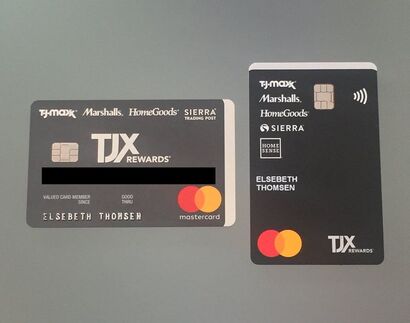 I have had these cards sitting on my desk for a while now to talk about UX. First off, I want to commend TJX for the great credit card redesign. Wonderful how they carried over the red edging — wish I could show this to you in a photo, but trust me it's pretty cool. And kudos to Mastercard for the logo redesign. It was nearly impossible to keep the red and orange interlocking "fingers" of the old logo in register while producing direct mail for them. — Drove both me and the printers crazy back during my Ammirati agency days. — Goes to prove that simpler is always better. But back to the original question. (And I can start a sentence with "but" as I am the "pictures" person after all) and as another blog justifies "some of the greatest writers of all time, have been starting sentences with “and” and “but” for hundreds of years." However, I digress. What is this thing called UX anyway? UX is short for User Experience. This has become a "thing" with both app and site design. I would like to propose that UX should be considered with all user-facing design at all times. How will the person be using or relating to your product? How can you make it easier for them? How can you make using it more intuitive? The last thing you want to do is "assume". You know what they say about ASS-U-ME. Take my TJX cards, for example. A smart redesign of the card to go vertical. Why? for me... this is how my cards fits into my wallet. I can quickly identify the card and I don't feel that I am sideways. If you were to study female wallets for power shoppers they often have both vertical and horizontal slots to maximize credit card storage. Power shoppers will be reward shoppers as they are savvy about their purchase power. Notice that jewel of a word after the TJX logo... "REWARDS". The other reason why it was brilliant to change the orientation of the card, which is indisputable and applies to every user beyond their wallet preference and design: chip readers are prolific and are becoming the norm over the swipe. It's so much easier, quicker, and more intuitive to pull the card straight out of your wallet and slide it straight into the chip reader. No wrist flipping needed. (remember the simple math — the shortest distance between two points is a straight line. Oh, the days of me trying to explain this to an NYC cab driver after leaving work at 2 a.m. and wanting to get back home to Brooklyn ASAP.) Yup, Marshalls has made my shopping experience both easier and quicker. This makes me a happy customer. That's a great UX, which means a relaxed customer which means a returning customer! It's a "win-win." While talking about credit card design, I want to commend American Express for finally producing the gold card out of metal. For years I worked on designing direct mail for the elusive "Amex Black Card". Having a card made out of titanium was unusual, cool, and had a "wow" factor that impressed friends and clients while picking up the tab (remember this card is for the high-net-worth). Yet, alas, I don't have a Black Card. Amex thought I was joking when I said they should give me one since I worked on successfully upping their client membership numbers. But I have to say... I love the feeling of my gold card. It just feels special. Like I am worthy... even if it isn't the black card and even if I don't care to share it with friends or clients. It makes me happy. This is good UX. What are signs of bad UX? Customer/user frustration sometimes ending with swear words. Actions that take longer than needed. We are living in an amped-up time-deprived world after all. And, anything that caused accidents.... well, this is just bad design Do not take good design for granted. The world is designed for right-handed people as most of the world is right-handed. (Many accidents are from left-handed people using right-handed designed products.) Form should follow function whenever possible. However, it can be the little things that can make a world of difference. Like changing the orientation of a credit card. So when you create any client interfacing opportunity, always ask yourself:
And in my perfect world... great design will last our lifetimes.
 Imagine this scenario. You want to treat a special someone to a homemade meal and you would like to make him/her one of their favorite dishes. You ask them what is their heart’s desire and the answer is “I’m not sure but I’ll know it when I taste it.” What would you do? Make 10 dishes and hope that one of them hits the spot? Well that would not be an efficient use of your time and would create a lot of waste — even from 10 dishes you can’t be sure if you will come close. This is why a person who is trying to bake your brand should ask you a lot of questions up front. These questions would be about the audience you are trying to feed. What are the demographics? Are their taste buds classic, contemporary, foreign or fusion. Are there any allergies or bad associations with a certain type of cuisine or key ingredient? Whenever I start a project I ask as many questions that come to mind. Why do I do this? Because I want to serve up a bunch of your favorites so you are delighted by the choice versus being left hungry for other options. And, like any great chef, I may throw in something with a twist for you to taste that you have never considered trying before. Together, we might just come up with your new favorite. 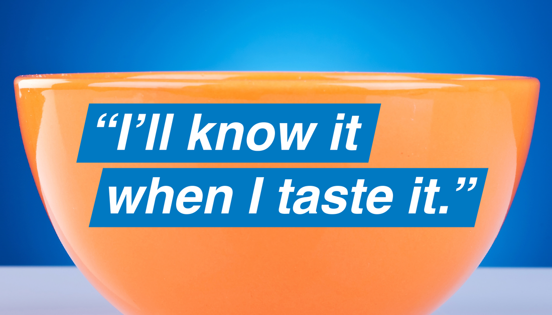
September 11th is still a hard day to get through. I was still living in Brooklyn at the time less than a mile from Ground Zero. It was a beautiful day. Not a cloud in the sky that was that amazing blue rich color that hopes are made of.
I will skip the part of what I experienced that day as they are memories I don't care to relive and will just say that the beautiful day was quickly shrouded in ash. Instead, what I would like to share, is how it brought the city together. The humanity experienced after September 11th I will never forget. In a city that when I moved there, I was given the advice to "never look anyone in the eye that you don't know", people where connecting in a way I never experienced. Everyone from all walks of life would look at each other in the eye with a silent confirmation that we were okay. That we survived. And with others a brief conversation if their friends and loved ones were okay. There were many stories of people that were supposed to be in the towers that day. A father of a friend of mine had a dentist appointment that day. A friend of another decided to take his kids to school that day. Those that avoided the tragedy that day I am grateful for. My heart still goes out to anyone who lost a family member, a friend, a co-worker. Buildings and lives are being rebuilt, however, it is a day that won't be forgotten. The Twin Towers, who ironically looked liked "II", are gone forever. My hope for humanity lives on. When I was a kid I always loved the strange words my mom would say like "whatchamacallit" and "thingamajig". Later on she taught me the beauty of creating two words in one play during Scrabble. Then in my professional life, when I was in my first briefing for Microsoft, I heard the most wonderful sounding word "wysiwyg". I couldn't wait to find out what that meant. Shortly after, naming a company, Zip2.com and seeing it sell so quickly was a thrill! At Ogilvy I was fortunate to have copy writing partners that would allow me during our conception phase to throw out a headline such as "CROSS BORDERS, NOT FINGERS." for DHL's international delivery service, and actually letting it get to presentation stage. Words are powerful, that is for sure. I'm a graphic designer and art director by training and love playing with typography. But when it comes to words, playing with them, it's just down right fun. So here it is and it is official. (drum roll here please). My first word:   Have you heard about the next big thing? There’s a buzz around it. Companies are trying to embrace it. Experts are being hired. Laggards are getting fired. Departments are being reorganized. New companies are emerging daily claiming to be experts on it. Digital marketing.
But… here’s some news. It’s not new. In fact, the whole strategy behind digital marketing has been around for a long time. CTA (call to action), CRM (customer relationship management), conversion, testing — all of this has been around for years. What was it called? "Direct Marketing." What's new? The platform. “The Internet is really about highly specialized information highly specialized targeting.” — Eric Schmidt With the advent of the World Wide Web came social networking platforms provides new funnesl for messaging — Social Media and eMarketing. It is new in that it’s a new vehicle for brands to reach out to customers and build brand awareness, loyalty and even create brand zealots. But the best practices are not new. From a Direct Marketing vet… yes, I dare admit it, the more I read, the more I smile, as the principles I’ve learned throughout my career still hold true for social media: 
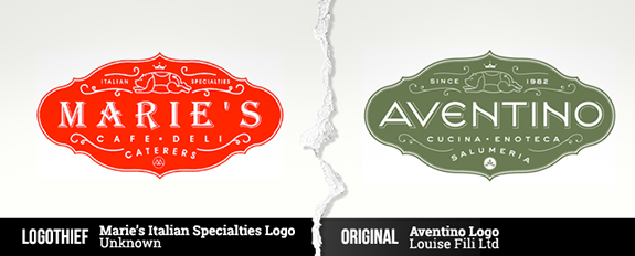 Apparently, according to Logo Thief, $24.99 gets you someone else's logo! Something to consider when you are looking to hire talent to create your brand identity. Design firms in other countries are not held to the same copyright laws as in the US. Might be okay if you are opening up a brick and mortar in Tristan De Cunha. However, most businesses need a website to confirm their legitimacy and to go for a broader reach… don't forget what the first 2 Ws stand for in www. Be sure to invest in a logo you know for sure you can call your own. As per Smashing Magazine, the biggest design mistake of all is copying somone else's.
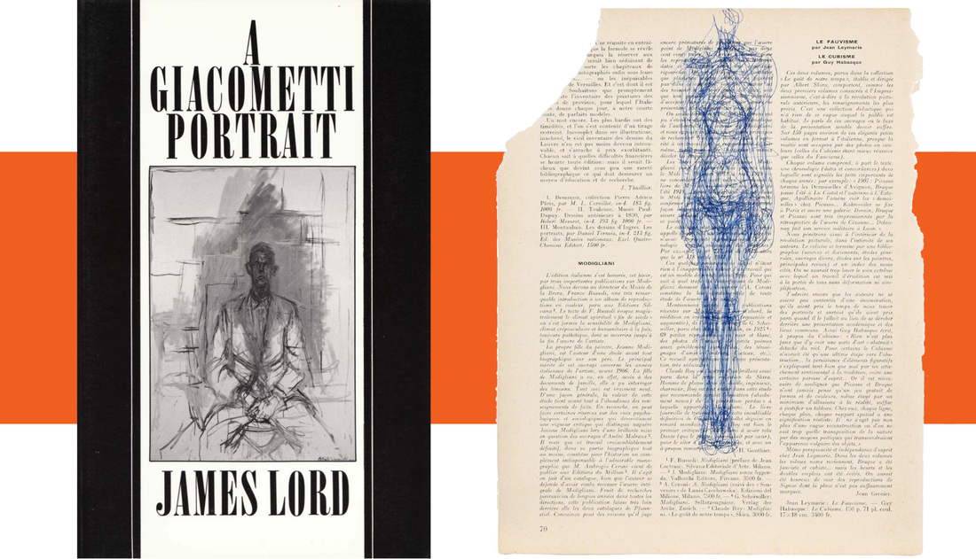
One of my favorite books is "A Giacometti Portrait" by James Lord. It put my mind to rest of my constant desire to make my work perfect and knowing it will always feel like "it's the beginning of what it could be."
Image on right ALBERTO GIACOMETTI Femme debout (certificate No. 1569), 1963 Ballpoint pen on book page courtesy Artsy.net.
A wonderful site and organization who's "mission is to make all the world's art accessible to anyone with Internet connection." |
Elsebeth ThomsenTaking all of my experiences Archives
March 2020
Categories
All
|


 RSS Feed