BRANDINGETC
  • WORK
    • BRANDING
    • LOGOS
    • ADS
    • WEB
    • MAIL
    • ETC
  • CLIENTS
    • BRANDOVER
    • COMMUNITY OUTREACH
    • CONSULTING
    • EDUCATION
    • FASHION
    • RETAIL
    • INVESTMENT BANK
    • MARKETING
    • REAL ESTATE
  • ABOUT
  • SCRIBBLES
  • TESTIMONIALS
  • CONTACT

JOTS. THOUGHTS. SCRIBBLES.

Some things just take time.

3/20/2014

1 Comment

 
Picture
How long does it take to build a brand*?
​
There are so many variances to this. Are you starting from scratch without even a name? Are you taking the legacy of a brand and improving on it? (What BRANDINGETC calls a brandover.) How many products or divisions does the brand need to apply to? In other words are you creating sub-brands? How many decision makers are involved with approving the brand development? 
     My experience shows that it it takes a bare minimum of 90 days to concept and design a brand identity. Yes, you can try to do it faster. But to develop a brand properly it is best to do the research including the competitive analysis, know what makes your idea better and different from others (your unique selling proposition - USP) and develop a mission statement. Give yourself and the brand the gestation time for both perspective and refinements.
     Once you think your brand is developed it doesn't stop there. You need build brand awareness, in other words spread the word about your brand. As in everything that is brought into this world, building a strong brand takes time. But with patience, determination, and keeping a watchful eye on it, your brand can grow to be strong and will live a long life. And, who knows, maybe it will have a brand of its own one-day.

*There are many definitions of the word "brand". For the purpose of this article we are talking about an idea that gets "wrapped" in a look and presented with a tone of voice so it can be communicated and consumed by the general public.
1 Comment

The acne of design

11/25/2013

0 Comments

 
One of the first projects I did for IBM I was called into a senior executive's office at Ogilvy. My offense? I changed the color of the register mark after IBM so that it matched the logo -- IBM blue.

My instincts were right by my application was wrong.

Register marks, copyright marks, and the rest… they are important and do serve a purpose. However, they don't need to take over your message.
Picture
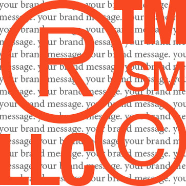
Some good go-bys from font.com
​

For ®s, TMs and SMs:
  • At text sizes, these symbols should be little smaller than half the x-height (height of lowercase) of your text.
  • As your text gets larger, the symbols should become proportionately smaller, especially in headlines
For ©s: 
  • When it appears after text (such as a company name), the symbol should be a little smaller than half of the x-height (heigh of lowercase) of your text.
  • When it appears before a year (as in ©2013), match the symbol size to the size of the first numeral. 


In "March of the Doohickeys" an article by Paul Rapp, a lawyer who specializes in intellectual property law, you can read about the purpose of all of these extra doodads.

Bottom line: the marks need to be legible but not overbearing and not a design element of your logo. So if you are designing a bill board, be sure to scale down the size of the register mark accordingly … it doesn't have to be the size of a stop sign. And if you are creating a logo for an LLC my recommendation is to make it look like a "mark" versus part of the name. And always always follow the brand guidelines.

0 Comments

Welcome to Scribbles

11/18/2013

0 Comments

 
Picture
I'm not a blogger. Let's just start there. 

However, I am a graphic designer, an art director and a creative director who has many years of experience working on brands of all sizes, big and small. Mostly big. The biggies — Amex, Microsoft, DHL to name a few. 

After years in the advertising industry and working for one of the biggest — Ogilvy — I decided to go back to school for interior design at New York School of Interior Design. I like to help people and I like to make things look good. And the idea of making a career out of helping people be happier in their homes appealed to me. —  But, I got frustrated. 

I didn't want my work to be disposable. And didn't love the idea criticizing someone else's designs for being "oh so last year". The Welsh and Danish in me insists on using things if they still look good, still work and can't be "renovated, updated, upgraded". Great design is timeless after all.

So, I made a conscious decision to combine my desire to help people, my compulsion to make things look good, and my experience of working with fortune 500s, to start my own business to help small and medium-sized businesses look good. 

"Scribbles" is a place where I will jot down tips and ideas that might help guide or inspire thoughts on branding or design in general. Now and then it will be used to offer kudos to my clients as it's their success that makes me happy. I am a designer with purpose after all.

0 Comments
    Picture

    Elsebeth Thomsen

    Taking all of my experiences
    of working with fortune 500 companies and massive advertising agencies, I moved to the Hudson River Valley to establish my own company. Now I help clients all over build their company's brand and am loving it!

    Archives

    March 2020
    November 2019
    July 2018
    August 2016
    September 2015
    July 2015
    December 2014
    March 2014
    January 2014
    December 2013
    November 2013

    Categories

    All
    ©
    ®
    Accord
    Advertising
    Art
    Art Director
    Bad UX
    Bake A Brand
    Black Card
    Brand Awareness
    Brand Design
    Brand Guidelines
    Brand Identity
    Branding
    Brand Name
    Brandover
    Copyright
    Creative Director
    Credit Card Design
    Design
    Digital Marketing
    Direct Mail
    Direct Marketing
    Domain Name
    Domain Registration
    Expectations
    Favorites
    Form Follows Function
    Graphic Designer
    Great Design
    Happy Customer
    Honda Accord
    Hungry For A Brand
    NY
    Plagiarism
    Port Jackson
    Power Shopper
    Quality
    Register Marks
    Shopping Experience
    Social Media
    Sub-brand
    Time
    Timeless
    Unique Selling Proposition
    UX

    RSS Feed

© 2020 BRANDINGETC
Picture
  • WORK
    • BRANDING
    • LOGOS
    • ADS
    • WEB
    • MAIL
    • ETC
  • CLIENTS
    • BRANDOVER
    • COMMUNITY OUTREACH
    • CONSULTING
    • EDUCATION
    • FASHION
    • RETAIL
    • INVESTMENT BANK
    • MARKETING
    • REAL ESTATE
  • ABOUT
  • SCRIBBLES
  • TESTIMONIALS
  • CONTACT