
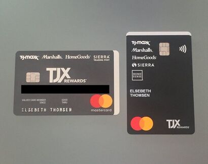
 I have had these cards sitting on my desk for a while now to talk about UX. First off, I want to commend TJX for the great credit card redesign. Wonderful how they carried over the red edging — wish I could show this to you in a photo, but trust me it's pretty cool. And kudos to Mastercard for the logo redesign. It was nearly impossible to keep the red and orange interlocking "fingers" of the old logo in register while producing direct mail for them. — Drove both me and the printers crazy back during my Ammirati agency days. — Goes to prove that simpler is always better. But back to the original question. (And I can start a sentence with "but" as I am the "pictures" person after all) and as another blog justifies "some of the greatest writers of all time, have been starting sentences with “and” and “but” for hundreds of years." However, I digress. What is this thing called UX anyway? UX is short for User Experience. This has become a "thing" with both app and site design. I would like to propose that UX should be considered with all user-facing design at all times. How will the person be using or relating to your product? How can you make it easier for them? How can you make using it more intuitive? The last thing you want to do is "assume". You know what they say about ASS-U-ME. Take my TJX cards, for example. A smart redesign of the card to go vertical. Why? for me... this is how my cards fits into my wallet. I can quickly identify the card and I don't feel that I am sideways. If you were to study female wallets for power shoppers they often have both vertical and horizontal slots to maximize credit card storage. Power shoppers will be reward shoppers as they are savvy about their purchase power. Notice that jewel of a word after the TJX logo... "REWARDS". The other reason why it was brilliant to change the orientation of the card, which is indisputable and applies to every user beyond their wallet preference and design: chip readers are prolific and are becoming the norm over the swipe. It's so much easier, quicker, and more intuitive to pull the card straight out of your wallet and slide it straight into the chip reader. No wrist flipping needed. (remember the simple math — the shortest distance between two points is a straight line. Oh, the days of me trying to explain this to an NYC cab driver after leaving work at 2 a.m. and wanting to get back home to Brooklyn ASAP.) Yup, Marshalls has made my shopping experience both easier and quicker. This makes me a happy customer. That's a great UX, which means a relaxed customer which means a returning customer! It's a "win-win." While talking about credit card design, I want to commend American Express for finally producing the gold card out of metal. For years I worked on designing direct mail for the elusive "Amex Black Card". Having a card made out of titanium was unusual, cool, and had a "wow" factor that impressed friends and clients while picking up the tab (remember this card is for the high-net-worth). Yet, alas, I don't have a Black Card. Amex thought I was joking when I said they should give me one since I worked on successfully upping their client membership numbers. But I have to say... I love the feeling of my gold card. It just feels special. Like I am worthy... even if it isn't the black card and even if I don't care to share it with friends or clients. It makes me happy. This is good UX. What are signs of bad UX? Customer/user frustration sometimes ending with swear words. Actions that take longer than needed. We are living in an amped-up time-deprived world after all. And, anything that caused accidents.... well, this is just bad design Do not take good design for granted. The world is designed for right-handed people as most of the world is right-handed. (Many accidents are from left-handed people using right-handed designed products.) Form should follow function whenever possible. However, it can be the little things that can make a world of difference. Like changing the orientation of a credit card. So when you create any client interfacing opportunity, always ask yourself:
And in my perfect world... great design will last our lifetimes.
1 Comment
|
Elsebeth ThomsenTaking all of my experiences Archives
March 2020
Categories
All
|
 RSS Feed